Optimising for Mobile Devices

Mobile Website Optimisation Guide — How to Optimise for Mobile Devices in Australian Healthcare Practices
Mobile optimisation means designing and tuning your website so people on phones get fast, usable and secure access to the things they need most — bookings, contact details and clinical information. Most local healthcare searches in Australia now start on a mobile, and a slow or awkward mobile site costs bookings and patient confidence. This guide explains mobile‑first indexing, responsive design, Core Web Vitals and local mobile signals, and gives practical steps clinics can use to turn mobile visitors into patients. You’ll learn how to audit mobile performance, apply responsive patterns (fluid grids, media queries, flexible images), speed up sites with prioritised tactics and measure results with PageSpeed Insights and Lighthouse. We also cover mobile booking and telehealth UX, structured data for healthcare pages, and how mobile optimisation ties into local SEO and Google Business Profile. If you’d prefer tailored help, our team can audit your mobile site and recommend the highest‑impact fixes before any build work starts.
Why Is Mobile Optimisation Critical for Healthcare Websites in Australia?
Mobile optimisation matters because most prospective patients use smartphones to search, compare and contact local clinics. A well‑optimised mobile site removes friction between intent and booking. With mobile‑first indexing, Google primarily evaluates the mobile version of a page for ranking, so content parity and mobile usability directly affect local visibility. Slow load times and layout shifts cause abandonment at the moment a patient is deciding between providers — that means fewer bookings and wasted ad spend. Clinics that prioritise mobile speed, clear contact actions and secure, accessible content win more organic and paid traffic, and improve patient experience, retention and referrals. The sections below unpack recent patient behaviour shifts and the indexing implications practice owners should know before they make technical changes.
How Has Mobile Usage Changed Patient Behaviour in Healthcare?
Patients now follow a fast search‑to‑action path: a quick mobile search often becomes an immediate call, an appointment booking or map directions within minutes. That raises local intent — queries like “dentist near me” or “physio open now” are action driven and need mobile pages with obvious CTAs, visible contact details and a smooth booking flow. Mobile users also prefer bite‑sized information: short service summaries, clear fee ranges and visible trust signals (reviews, accreditations) that can be scanned quickly. Map the typical mobile journeys — search → Google Business Profile → website booking — and remove barriers between discovery and appointment to improve conversion. Understanding those journeys helps you prioritise technical fixes that actually drive bookings.
What Impact Does Google’s Mobile‑First Indexing Have on Medical Websites?
Mobile‑first indexing means Google mostly uses the mobile version of your pages for crawling and ranking. Any mismatch between desktop and mobile content can hurt visibility. If the mobile site hides content, uses different metadata or performs worse, your ranking potential falls behind competitors with content parity. For healthcare sites this includes ensuring service pages, FAQs and structured data match across versions so Google accurately understands your offerings and eligibility. Audit mobile pages for missing headings, truncated content or blocked resources, then align metadata and structured data to avoid indexing issues. Once fixed, your site is easier for search engines to read and more discoverable for patients.
What Are the Key Principles of Responsive Web Design for Healthcare Practices?

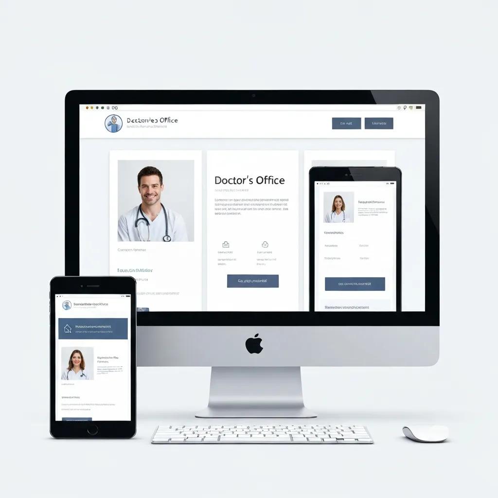
Responsive design means one website that adapts cleanly to every screen using fluid layouts, flexible images and CSS media queries. The technique relies on percentage‑based grids, scalable media and breakpoints that prioritise critical elements — like click‑to‑call buttons and booking widgets — on small screens. For clinics that typically means putting phone, services and opening hours front and centre on mobile so intent‑driven visitors can act immediately. Test on emulators and real phones to verify typography, spacing and touch targets remain usable, and to ensure content parity for Google’s mobile crawler. Below we compare responsive components and give clinic‑focused tips for each.
Different responsive components deliver specific benefits for mobile users and search engines.
| Component | How it works | Practical tip for clinics |
|---|---|---|
| Fluid grids | Layout proportions scale using percentages and relative units | Let the primary column collapse to a single column under 600px so the booking CTA stays prominent |
| Flexible images | Images resize with max‑width rules and responsive srcset attributes | Use srcset and WebP/AVIF variants to serve smaller images to mobile users |
| Media queries | CSS breakpoints apply different styles at screen width thresholds | Set breakpoints for common mobile widths and hide non‑essential sidebar content |
| Content prioritisation | Reorders and surfaces high‑value actions on small screens | Place phone, booking link and directions above the fold on mobile |
Focus on these responsive parts first — they usually yield quick usability gains and improve Core Web Vitals. The next section explains how speed ties into those metrics and which tactical steps to take.
How Do Fluid Grids and Flexible Images Improve Mobile Experience?
Fluid grids adapt the page to available width, preventing horizontal scrolling and keeping primary actions visible — which reduces cognitive friction for patients. Flexible images preserve aspect ratio and prevent layout shifts: max‑width:100% and srcset ensure images load at the right resolution and cut down CLS. These techniques stop booking buttons or form fields from jumping during load, so pages feel reliable and completion rates rise. Serving responsive image formats also lowers mobile bandwidth use, which matters with Australian data plans and improves perceived speed. Together, these changes support better patient engagement and stronger search signals.
What Are the Benefits of Responsive Design for Patient Engagement and SEO?
Responsive design lowers bounce, increases time on site and makes key actions — call, book, get directions — instantly available on mobile. Search engines favour responsive sites because a single URL simplifies crawling and indexing, reducing duplicate content and keeping metadata consistent across devices. For healthcare sites, responsive patterns also improve accessibility and readability for users with vision or motor limitations, which builds trust. Those gains translate into more appointments and better local rankings — a direct link between design choices and business outcomes. Next, we’ll cover speed tactics that amplify the benefits of good responsive design.
How Can Healthcare Practices Improve Mobile Site Speed to Retain Patients?
Faster mobile pages reduce abandonment and directly lift booking conversions — especially when paired with clear CTAs. Core Web Vitals — Largest Contentful Paint (LCP), Interaction to Next Paint (INP) and Cumulative Layout Shift (CLS) — measure perceived speed and responsiveness. Modest engineering and content changes often move these metrics enough to make a real difference. Start with image optimisation, caching and removing unused JavaScript as quick wins, then move to CDN adoption and server compression for deeper gains. The table below helps clinics decide which speed techniques to prioritise.
Key optimisation techniques differ by mechanism and expected improvement; use the table to rank priorities.
| Technique | Technical attribute | Expected benefit & typical improvement |
|---|---|---|
| Image optimisation | Convert to WebP/AVIF and use responsive srcset | Reduces payload — often a 30–70% cut in transfer size |
| Caching & TTL | Browser caching and server cache headers | Faster repeat visits; can reduce time‑to‑interactive by 20–40% |
| Minify & inline critical CSS | Remove unused CSS and inline above‑the‑fold rules | Improves the render path and LCP by cutting render‑blocking |
| Defer non‑critical JS | Async/defer non‑essential scripts | Lowers main‑thread work and improves INP responsiveness |
This comparison helps clinic owners choose quick wins versus longer engineering work. The following subsection defines Core Web Vitals and gives a prioritised checklist you can act on.
What Are Core Web Vitals and Why Do They Matter for Mobile Speed?
Core Web Vitals are user‑centred metrics: LCP measures how quickly the main content appears, INP captures interaction responsiveness and CLS tracks visual stability during load — an important metric on small screens where content shifts can cause accidental taps. Healthcare sites often see LCP problems from large hero images or booking widgets; CLS frequently comes from late‑loading images or injected content that shifts buttons. Improving these metrics usually raises form completions and click‑to‑call rates because pages feel faster and more reliable. Monitor these metrics with PageSpeed Insights and Google Search Console’s mobile reports, and prioritise fixes that move the needle for patient conversions.
Which Practical Steps Boost Mobile Site Speed for Medical Websites?
Start with quick wins: compress and serve responsive images, enable browser caching and remove unused third‑party scripts. Next, add responsive image formats, inline critical CSS and defer non‑critical JavaScript to improve render times and interactivity on phones. For more advanced gains, use a CDN to serve static assets closer to patients, enable Brotli or gzip compression on the server, and audit third‑party widgets (chat, booking, analytics) for performance impact. Retest regularly with Lighthouse and mobile speed tools, prioritising changes that show the biggest improvements in Core Web Vitals, and iterate until booking flows and contact actions are reliably fast.
How Do You Enhance Mobile User Experience on Healthcare Websites?

Improving mobile UX focuses on navigation, touch‑friendly interactions and stripped‑back forms so patients can find and book care with minimal effort. Make contact actions persistent — a header or sticky footer with phone, booking and directions — so users can act from any page. Use legible typography at small sizes and a clear hierarchy so patients reach core services quickly: concise headings, short paragraphs and bulleted lists improve scan‑ability. Reduce form fields to essentials, use mobile‑friendly input types and offer autofill or suggested appointment times to cut typing. Below is a short checklist of UX patterns to apply right away and why they work.
- Make primary CTAs prominent and persistent: Keep booking and call actions visible across mobile screens.
- Use large, touch‑friendly targets: Targets of at least 44×44 pixels prevent mis‑taps.
- Design mobile‑first forms: Minimise fields and provide inline validation to speed completion.
Applying these patterns improves conversion and patient satisfaction quickly; the next subsection covers navigation and touch‑target details.
What Navigation and Touch‑Friendly Features Improve Mobile Usability?
Simple navigation patterns work best on mobile: a collapsed menu, visible search and a persistent action bar that surfaces booking and call options reduce taps to conversion. Maintain comfortable spacing between touch targets and use clear iconography and labels so actions are obvious. Prioritise content by action value: contact, services, fees, reviews, then detailed clinical pages — this gets high‑intent users to booking faster. Swipe‑friendly carousels for testimonials or service highlights can help discovery without crowding the viewport. The next section explains content and form tactics to reduce friction further.
How Should Content and Forms Be Optimised for Mobile Patients?
Keep content concise and scannable with clear headings, short paragraphs and bullets so patients find relevant information fast. Use progressive disclosure for clinical details — show essentials first and let users expand for more — to keep mobile pages uncluttered. Forms should only ask for what’s necessary, use appropriate input types (tel, email, date) to trigger the right keyboards and include autocomplete and toggles to cut typing. Offer click‑to‑call and calendar‑based appointment slots to shorten conversion time and reduce abandonment — fewer partial submissions make measurement cleaner, too. With content and forms aligned, mobile visitors face minimal friction when booking care.
How Does Mobile Optimisation Support Local SEO and Patient Acquisition?
Mobile optimisation supports local SEO by improving user signals — lower bounce, stronger engagement and higher conversion — signals search engines use to judge local relevance. Mobile‑friendly booking links, accurate service listings and correctly implemented local structured data help Google surface your clinic for “near me” searches on phones. Consistent NAP (name, address, phone) across your site, directories and Google Business Profile strengthens trust for patients and search engines alike. The table below compares key mobile local signals and the practical steps clinics should take to capture on‑the‑go patient intent.
| Local signal | Mobile behaviour factor | Implementation steps |
|---|---|---|
| Google Business Profile | Click‑to‑call and direction requests rise on mobile | Keep booking link, services and opening hours mobile‑friendly and up to date |
| Local structured data | Improves rich results on mobile SERPs | Implement LocalBusiness and MedicalBusiness schema with service and offer markup |
| NAP consistency | Affects trust and citation matching across mobile directories | Audit directories and ensure uniform listings and phone formatting |
| Mobile booking integration | Directly affects conversion from mobile searches | Use booking URLs or APIs that open native appointment flows on mobile |
Optimising these signals helps clinics capture immediate intent from mobile searchers; the following subsections explain GBP actions and NAP audits in more detail. After that, we outline how Milkcan Marketing bundles technical and local improvements for busy clinics.
How to Optimise Google Business Profile for Mobile “Near Me” Searches?
Optimise your Google Business Profile to convert mobile queries: add a mobile‑friendly booking link, succinct service summaries and high‑quality images that load quickly on phones. Keep categories and attributes accurate so your profile surfaces for the right searches, and use Google Posts for timely updates like holiday hours or short promotions visible to mobile users. Make sure phone numbers and appointment links are click‑to‑call ready and that the booking URL opens correctly on mobile browsers or native apps. Check GBP insights regularly to see which terms and assets drive calls and directions, then tweak your content to match the most common mobile intents.
Why Is NAP Consistency Important Across Mobile Platforms?
Consistent NAP ensures directory and GBP citations match your website, strengthening local ranking signals and reducing confusion for patients who cross‑check multiple sources on mobile. Inconsistent phone formats, abbreviated addresses or different trading names fragment local signals and can reduce visibility. Run a site‑wide and directory audit, prioritising the listings that get the most traffic, and standardise phone, business name and address formatting everywhere. Use a centralised citation management tool or manual fixes for high‑value listings to reduce discrepancies and stabilise local performance over time. The next section describes a practical agency approach that combines these technical and local fixes.
What Is Milkcan Marketing’s Approach to Mobile Optimisation for Healthcare Practices?
At Milkcan Marketing we treat mobile optimisation as part of Local SEO, content strategy and custom site design for small dental and healthcare practices. Our work is practical, affordable and focused on increasing appointments. We start with a targeted mobile site audit to identify Core Web Vitals bottlenecks, responsive gaps and local signal issues, then turn those findings into a prioritised implementation plan keyed to patient acquisition. We keep pricing transparent, avoid lock‑in contracts and use healthcare experience to recommend realistic fixes — booking flow shortcuts, GBP improvements and content parity for mobile‑first indexing. For practices that want quick wins, we offer consultations and prioritised action plans that increase mobile conversions and local visibility.
How Do Tailored Mobile Solutions Drive Patient Growth?
Tailored mobile work links technical improvements to measurable patient outcomes: better rankings, faster booking flows and higher mobile conversion rates. Addressing LCP and INP bottlenecks, simplifying navigation and adding click‑to‑call and calendar integrations usually raises booking completions and phone enquiries from mobile users. Our process includes ongoing monitoring and iterative optimisation so changes are measured against appointment KPIs and local search performance — ensuring engineering work delivers patient growth. We also refine content and GBP assets based on observed mobile search behaviour.
What Case Studies Demonstrate Mobile Optimisation Success?
Where we can, we share anonymised case studies that connect mobile improvements to real results — faster mobile load times, better Core Web Vitals and more bookings. When specific examples aren’t published, we use realistic anonymised scenarios to show typical outcomes after optimisation. For example, a clinic that cut LCP by optimising images and deferring scripts often sees a clear uplift in mobile booking completions; another that fixed GBP and tightened NAP consistency typically gets more calls and direction requests from nearby patients. To see how these outcomes might apply to your practice, request a free mobile site audit or consultation and we’ll identify priority fixes and forecast potential gains in bookings and visibility.
Frequently Asked Questions
What are the common mistakes to avoid when optimising a mobile healthcare website?
Common mistakes include ignoring mobile‑first design, not keeping content parity between mobile and desktop, and failing to prioritise speed. Clinics often miss obvious CTAs or use large, unoptimised images that slow pages. Regular usability testing and simple checks for essential information (phone, booking, hours) will prevent most issues and protect conversion rates.
How can clinics measure the effectiveness of their mobile optimisation efforts?
Use Google PageSpeed Insights and Lighthouse to track Core Web Vitals like LCP and CLS, and monitor engagement metrics — bounce rate, session duration and conversion rate — in Google Analytics. Google Search Console also shows mobile indexing and usability issues. Combine lab metrics with real user data and appointment KPIs to see the full picture.
What role does user feedback play in mobile website optimisation?
User feedback is invaluable. Run short surveys, usability tests or review behaviour analytics to discover friction points — navigation snags, form drop‑offs or unclear CTAs. Fixes driven by real user feedback tend to produce the largest lifts in conversions and satisfaction.
How often should healthcare practices update their mobile websites?
Update your mobile site at least every six months, or sooner if services, technology or user behaviour change. Regular updates keep content accurate and ensure you’re following current optimisation practices and search engine expectations. Continuous improvement based on analytics and feedback is the most reliable way to maintain performance.
What are the best practices for creating mobile‑friendly forms?
Keep forms short and ask only for essential information. Use mobile‑specific input types (tel, email, date), provide inline validation, enable autocomplete and offer quick appointment time slots to reduce typing. Large touch targets and clear labels also help completion rates on small screens.
How does mobile optimisation impact patient trust and retention?
A fast, easy mobile experience builds trust. When patients can quickly find information, book appointments and contact your clinic without friction, they’re more likely to return and recommend your practice. Reliable mobile experiences also reflect well on your professionalism and care standards.
What are the implications of not optimising for mobile users?
Not optimising for mobile risks lower search visibility under Google’s mobile‑first indexing, higher bounce rates and lost bookings. A poor mobile experience can damage reputation and reduce revenue opportunities. In a mobile‑first world, neglecting optimisation puts clinics at a competitive disadvantage.
Conclusion
Optimising your healthcare website for mobile is no longer optional — it’s essential for patient engagement and bookings. Responsive design and focused speed work make the booking journey fast and trustworthy, which increases conversions and supports growth. Start with an audit, fix the highest‑impact items and measure outcomes against appointment goals. If you’d like help, our team can provide a tailored plan to reduce mobile friction and lift local visibility so your practice thrives in a mobile‑first world.


